Design > Frameworks
Framework design
Case study 3 - design patterns and navigation
A complete site redesign required a new UI framework, design patterns and a responsive navigation model.
Design patterns
As part of a site redesign at Barclays I explored how a 'tile' concept design could work responsively with the site content. Part of forming a UI design pattern was understanding if we could create re-usable page templates to increase design efficiency and consistency throughout the site, whilst still maintaining ease of use and meaningful content design.
Firstly, I placed the tiles on different sized, responsive grids, to understand how the tiles would behave and move around on different screen sizes.
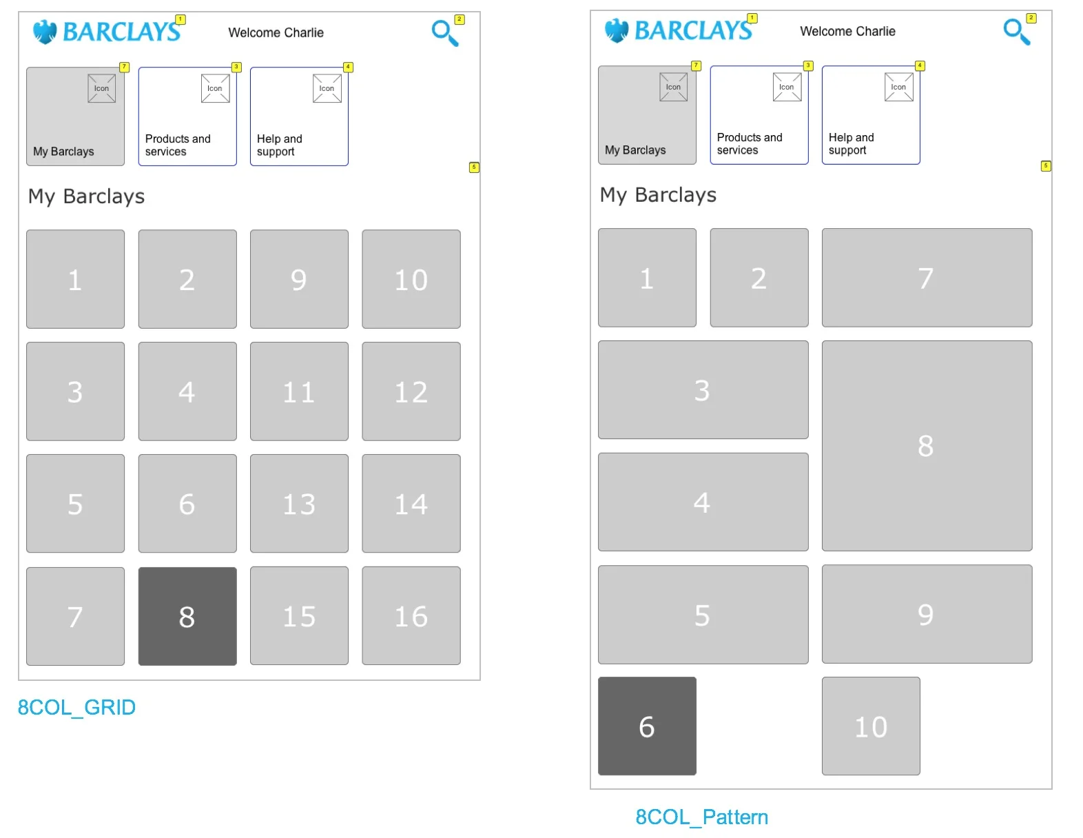
Exploring an 8 column grid
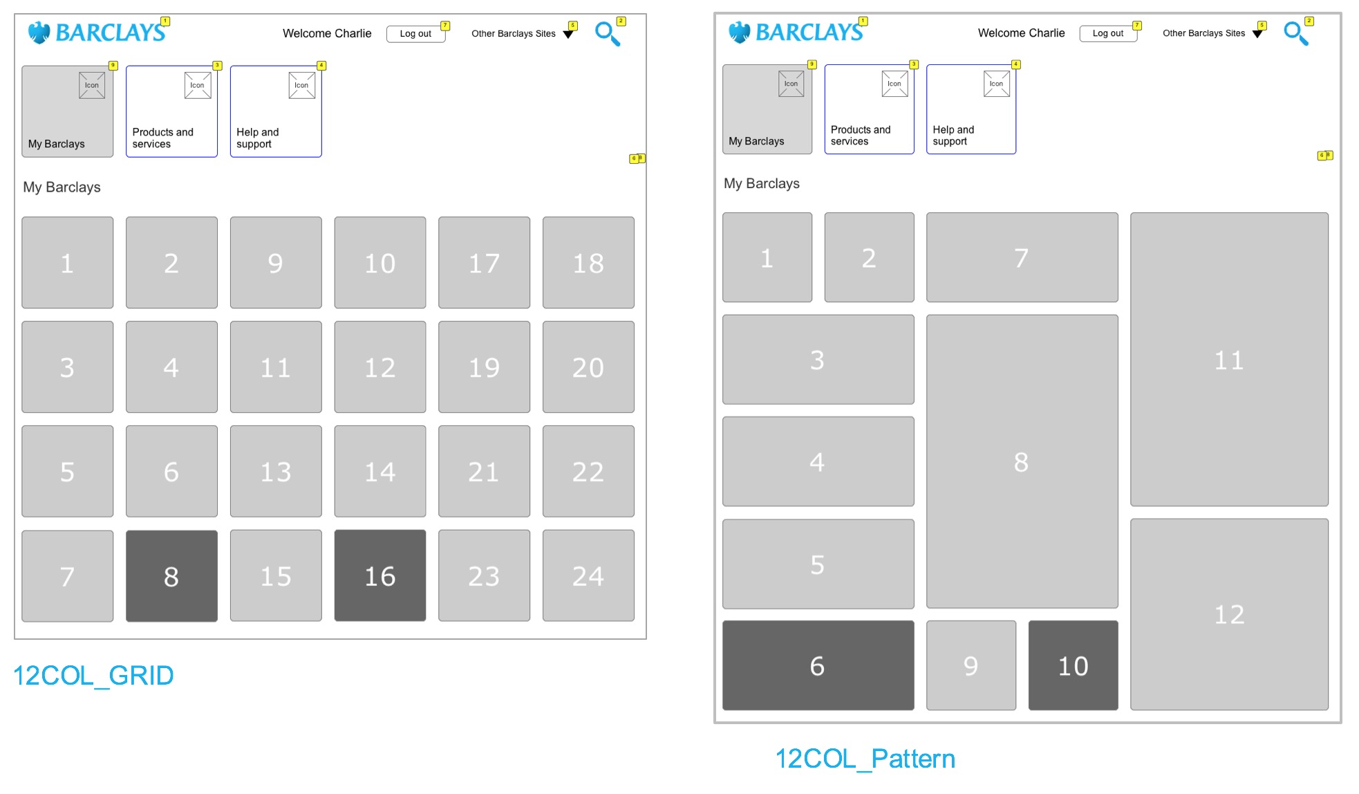
Exploring a 12 column grid
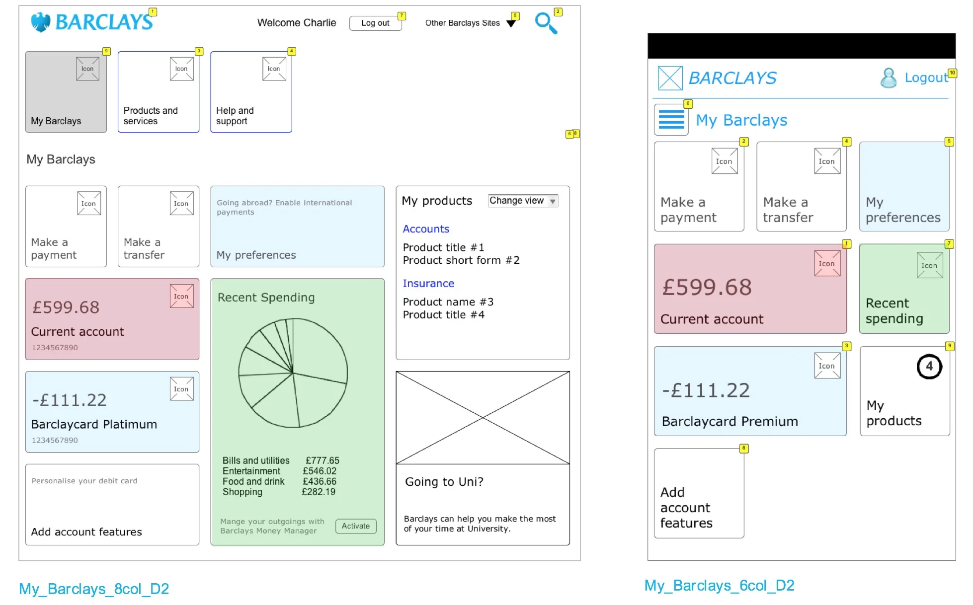
Understanding how the content would behave on different screen sizes
I then tried different tile layouts on the grids and layered in real content to see how the layout would respond on different screens sizes.
Conclusion: We needed to use adaptive design in some areas of the site as some critical site content was being de-prioritised in smaller screen sizes, due to the nature of responsive design. Also, adaptive design allowed us to optimise the content according to the screen site more effectively.
Navigation
As part of the same project, I also investigated some global navigation solutions.
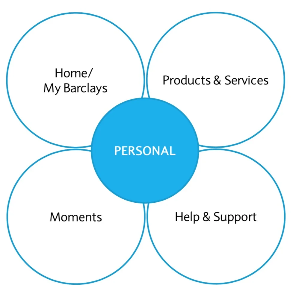
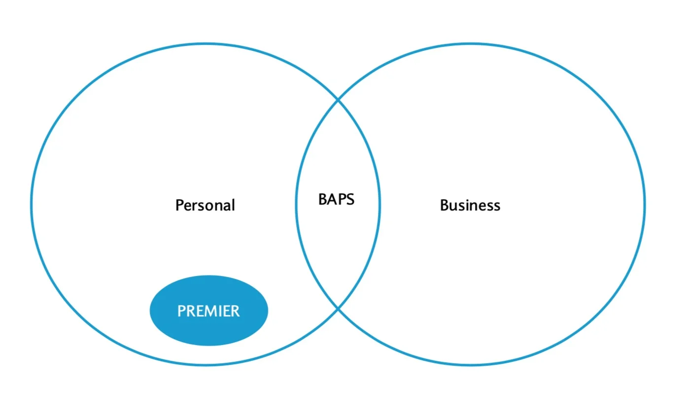
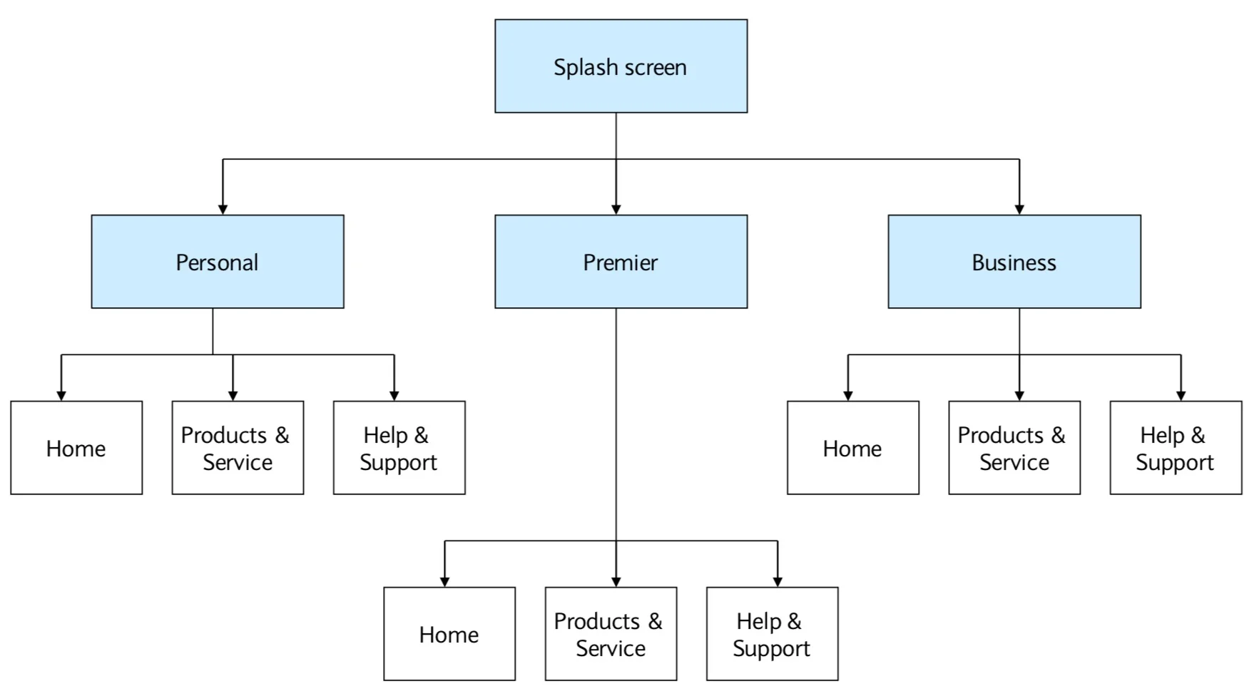
Following extensive site mapping and IA exercises I completed, the design team were able to boil the core site structure down to four main areas. I then looked at how the different customer segments would sit across these areas and how these users would navigate the site and content.
After multiple rounds of design, I settled on three models which could work with the content and customer segments. These models were then tested with users.
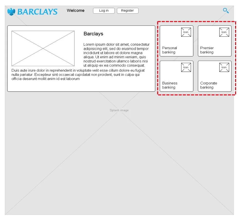
Splash screen concept
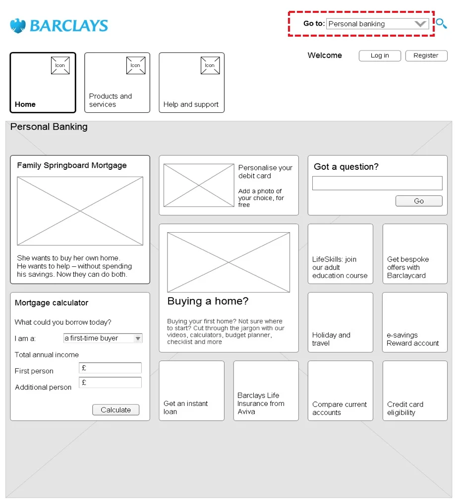
Toggle concept
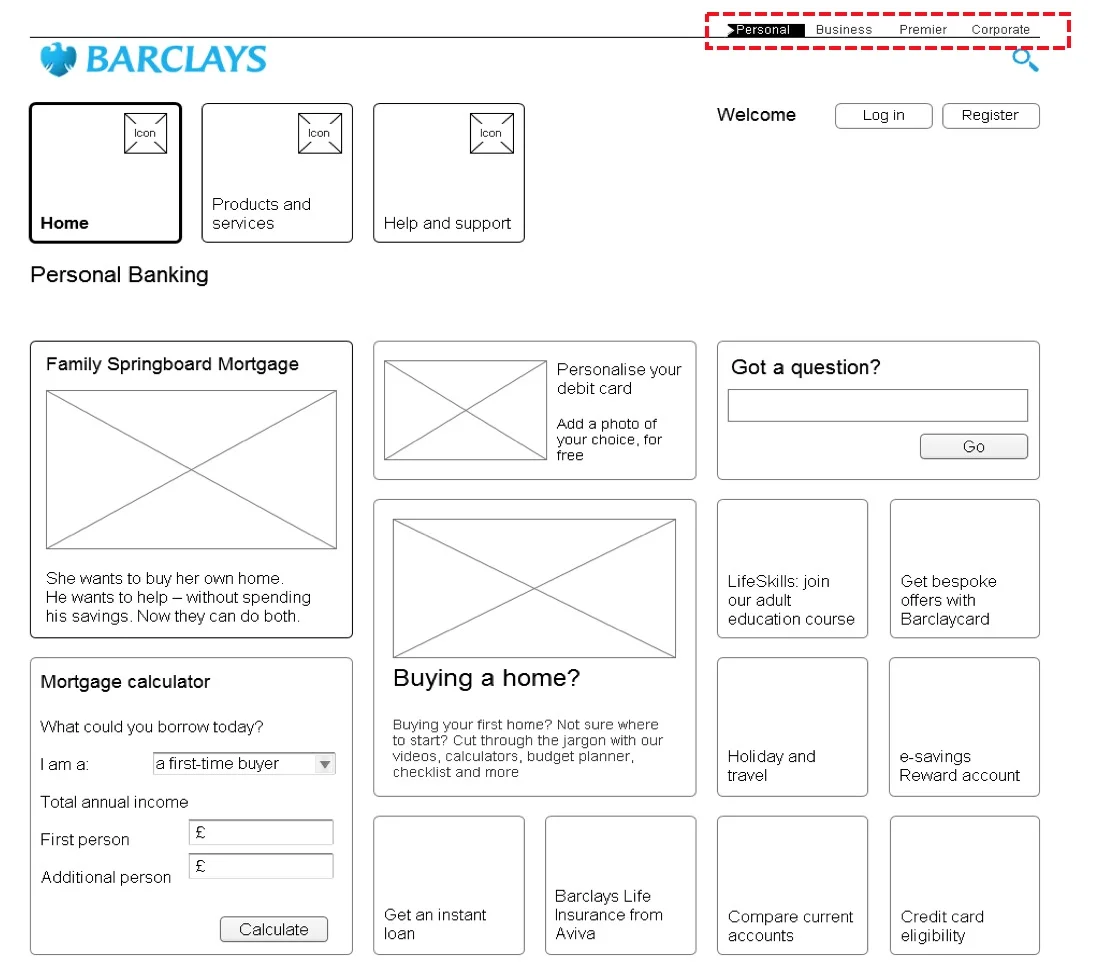
Tab concept
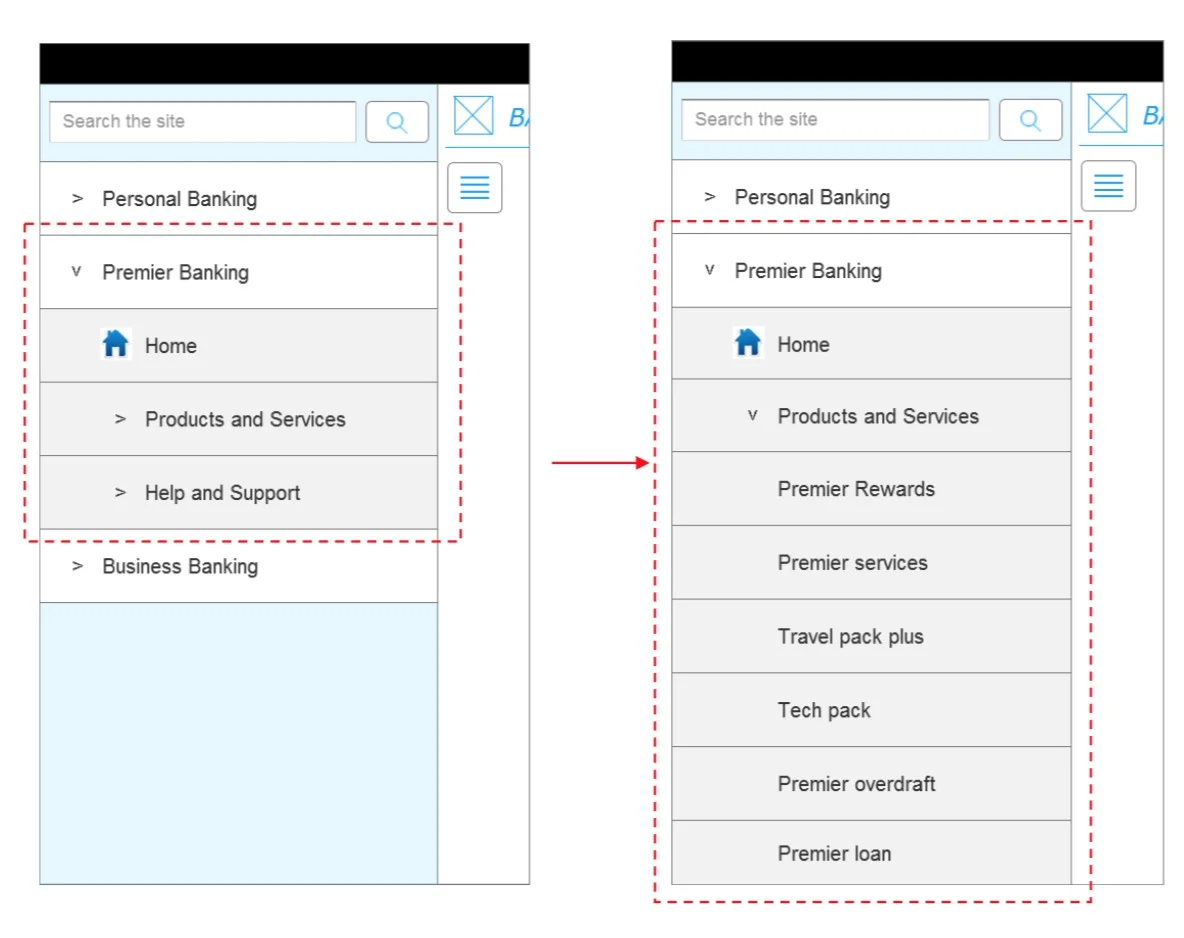
Building customer segments into the mobile navigation